Step 1
Identify Requirements
Denon DJ, newly acquired by inMusic, required a bold "statement" product offering to reassert its market leadership and reassure its user-base. This consumer product needed to leverage newer technologies, posess a low learning-curve for users, and be an attention generating head-turner. This strategy would enable the company, under new ownership, to disrupt a mature market and carve out its role as the de-facto standard.
Our team worked through every phase of the product design process, from market research, to wireframes, user workflows, all the way through QA testing to mass production. I led Interaction Design and was responsible for user interface development and user experience. A posititive user experience would play an essential part in reinforcing the brand's promise under new ownership.
Official Website : denondj.com/sc5000prime
Official Micro-site : sc5000m.com

Step 2
User Flows & Stories
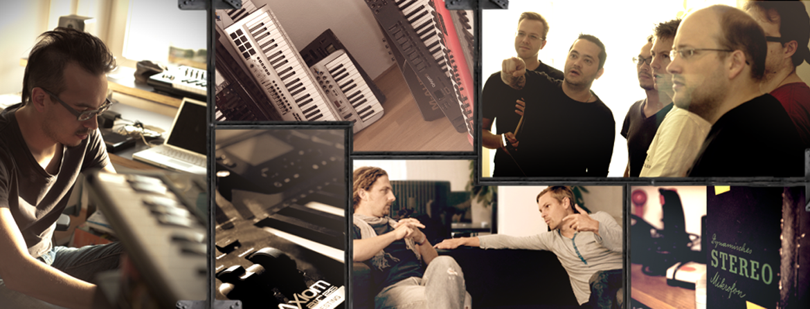
As a product category specialist, I partnered with the Product Manager to flesh out early concepts and understand business goals. We created epics and user stories in order to capture the descriptions of the main features of the app from the perspective of the end-user. This helped to describe the type of user, what tasks they wanted to accomplish and why.
Step 3
Validate Strategies
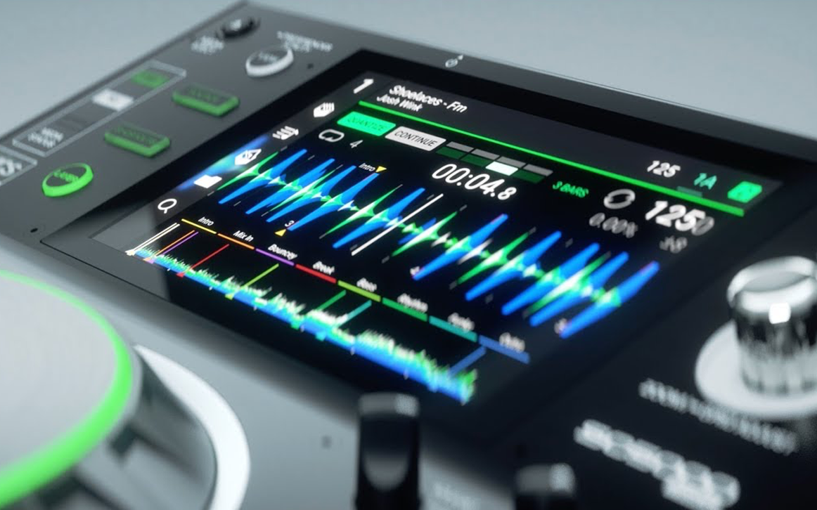
Our team leveraged newer technologies through introducing a 7" multi-touch display and quad-core DSP processing to the product category. Iterative paper mockups were used to validate initial interaction concepts. These key product decisions were further validated on both user and distributor / market levels via receptive informational meetings and user research interviews. User Interface designs were brought to the software engineering team in order to accurately deduce technical feasability and "expense" of the solution.
Step 4
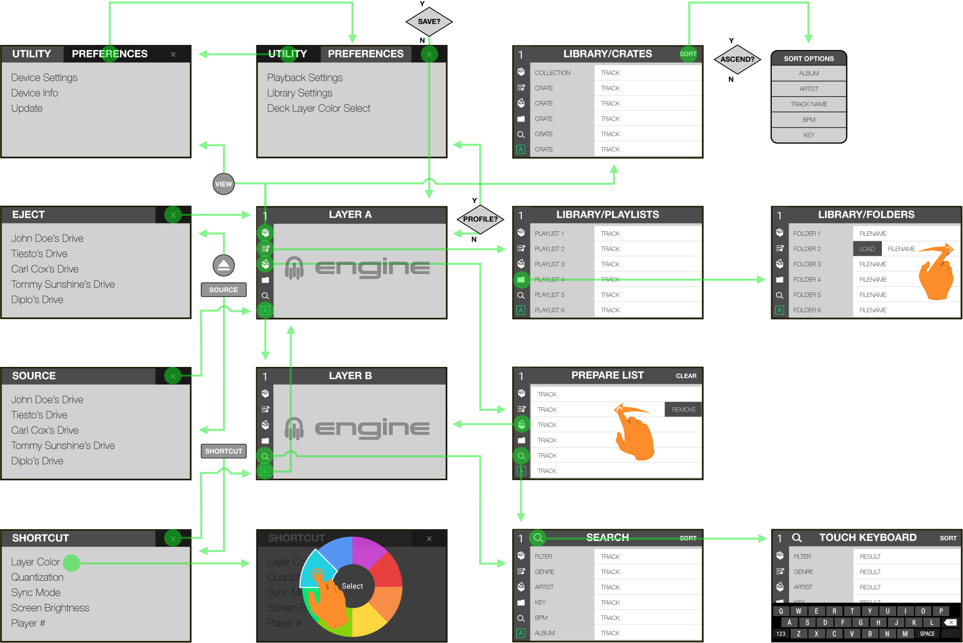
Information Architecture
Developing a harmonious logic between all hardware and software elements was my central-focus in structuring the application's information achitecture. Mapping out the application allowed stakeholders to effectively guage how frictionless our user workflows would be as compared to other industry offerings.
Step 5
Wireframes
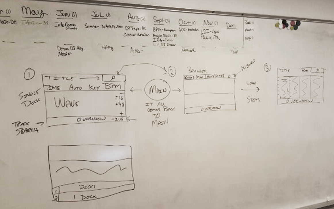
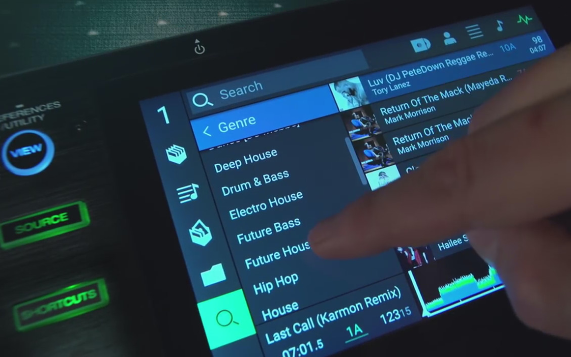
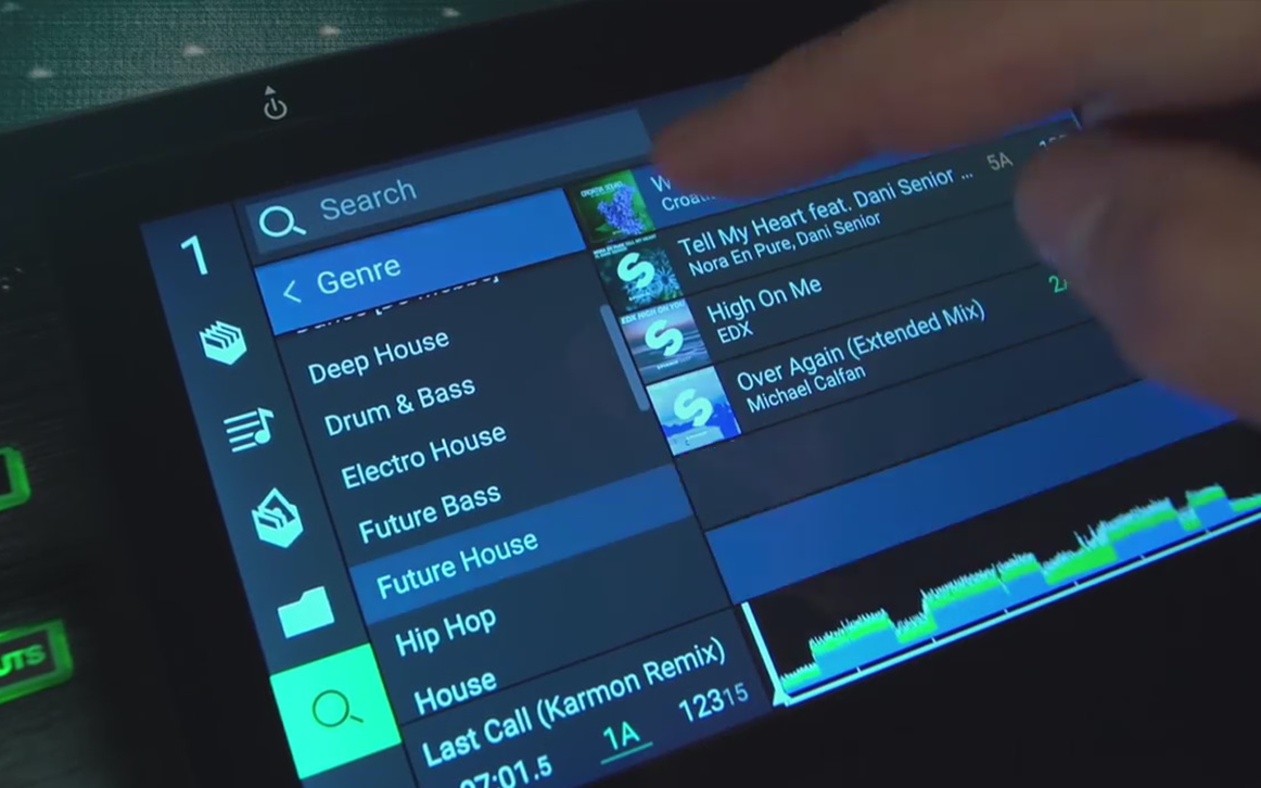
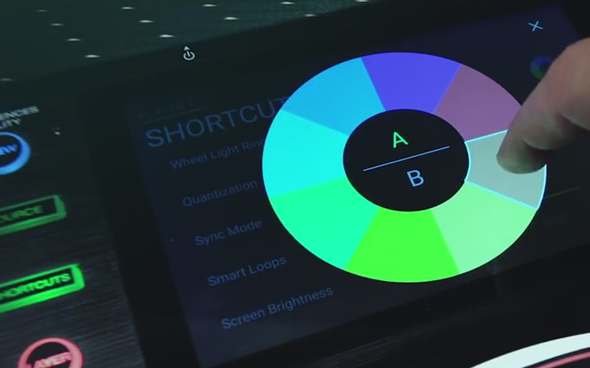
With our core design decisions validated, I started generating low fidelity wireframes. These wireframes provided the product team and stakeholders with a visual guide for the complex structure of the application and most importantly, how the user will interact with it. In order to make user workflows more performant, I leveraged simple touch-gesture interactions to complete complex user tasks.
Step 6
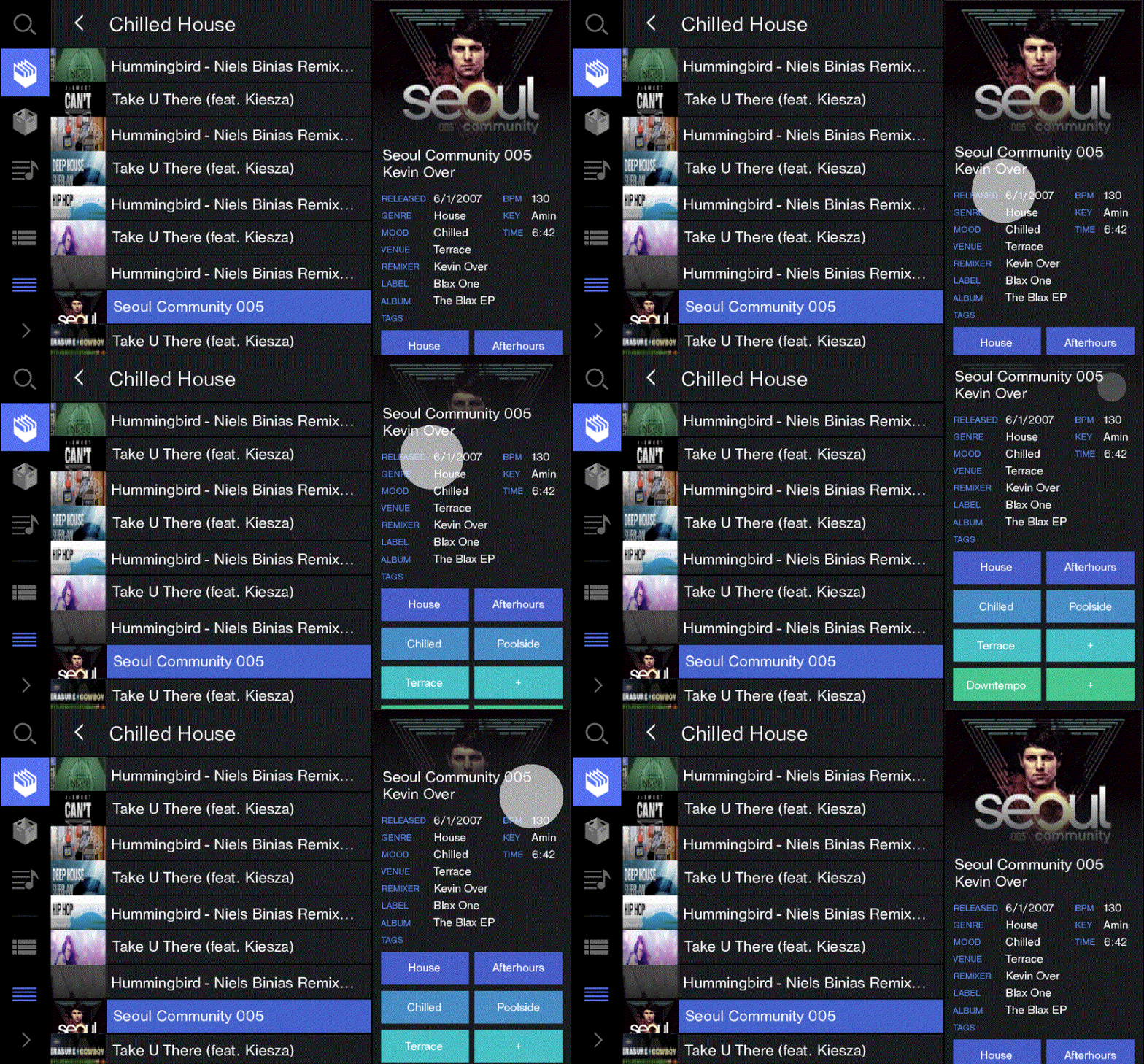
User Interface Mockup
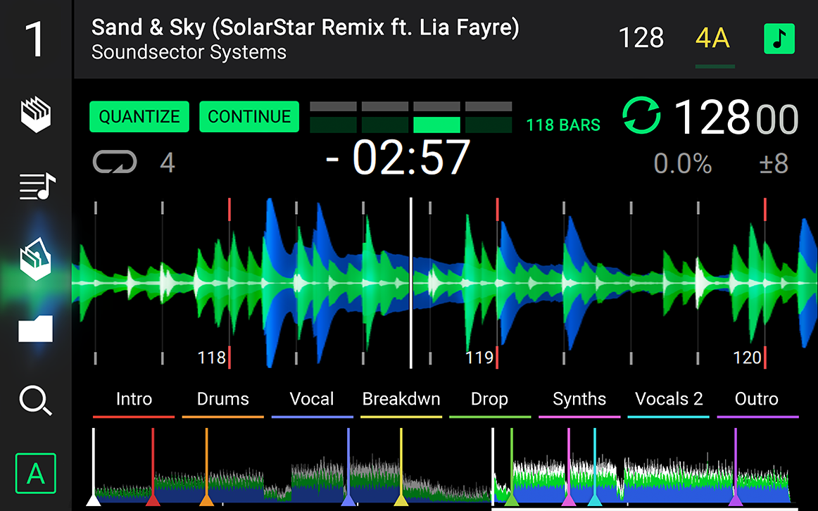
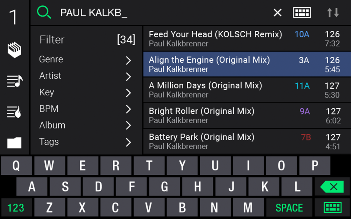
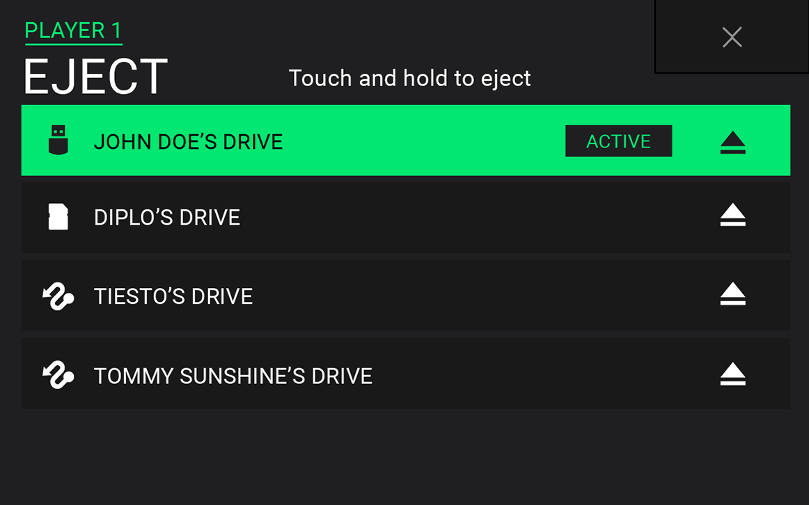
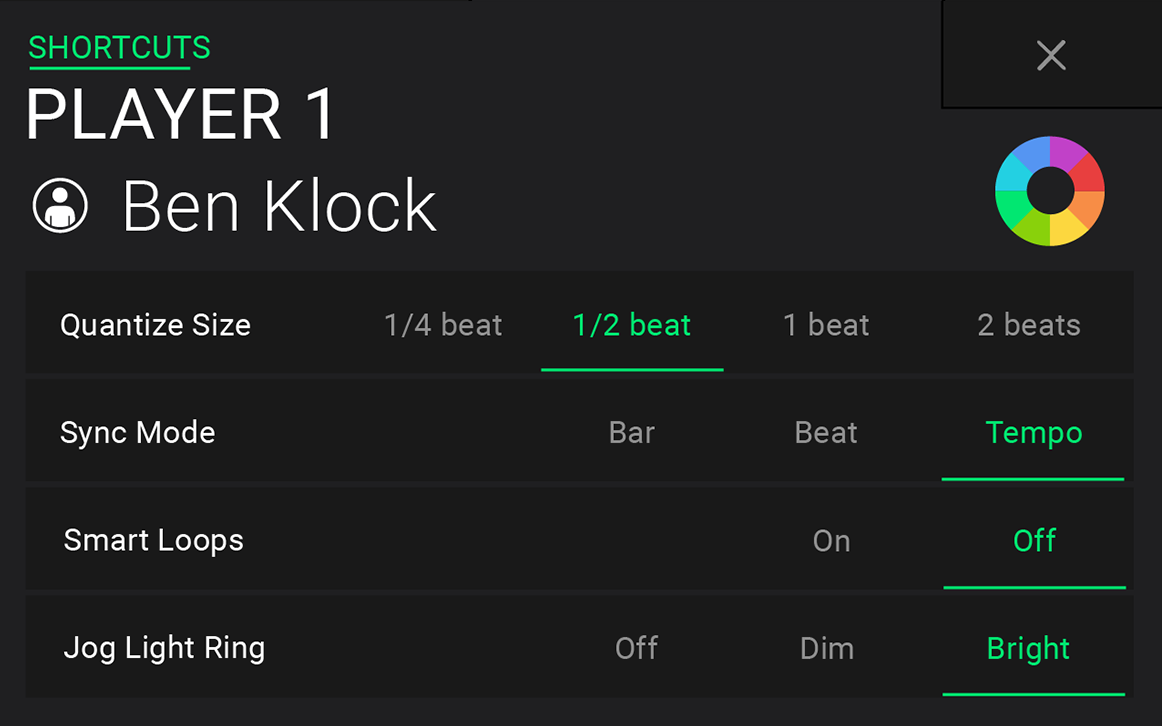
The user interface was comprised of a 7" multi-touch display, two rotary encoders, a pitch slider, performance pads, jog wheel, in-jog display, rgb light ring, and an array of buttons and I/O. Wireframes specific to the touchscreen UI were further developed into high-fidelity release assets for the software engineering team.
#01e771
Primary Accent - Spring Green
#fcd73f
Secondary Accent - Bright Sun
#919191
Secondary Accent - Gray
#007ecc
Secondary Accent - Lochmara
#364a77
Background - San Juan
#1f1f21
Background - Deep Graphite
Step 7
Implementation
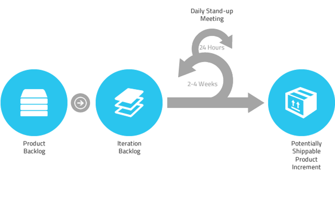
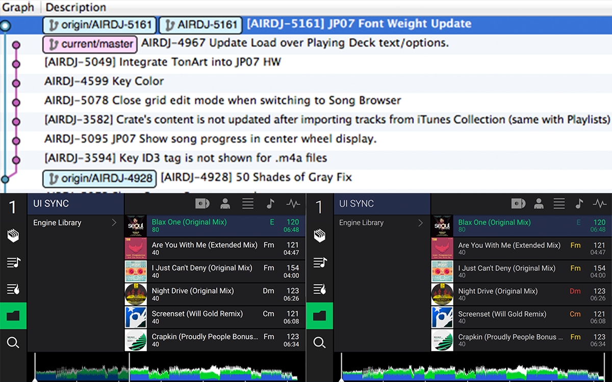
Agile development was practiced during my collaboration with the software engineering team. I coded up front-end increments, merged commits, advocated front-end Sprint planning, reviewed development builds and detailed out acceptance criteria to ensure swift and accurate development cycles.
Step 8
Testing & Iteration
Quality Assurance testing is performed on each feature implement prior to its inclusion in the product application. Once a feature's acceptance criteria is successfully met, the implement solution is user tested and iterated upon based on qualitative and quantitative user testing data. The three-band EQ waveforms were the most heavily iterated upon feature for this project — the rendered waveforms received many optimizations for expressiveness, transient clarity and algorithmic accuracy.
Step 9
Refinement & Finalization
I continuously evaluated user-workflows and refined the user experience throughout development—making note of feature improvements alongside the Product Manager. Due to the software being programmed onto physical devices for mass production, a clean finalization of all 1.0 development was a requirement. Further feature improvements were prioritized and scheduled within the development backlog for forthcoming update releases.

Project Assessment
Summary & Reviews
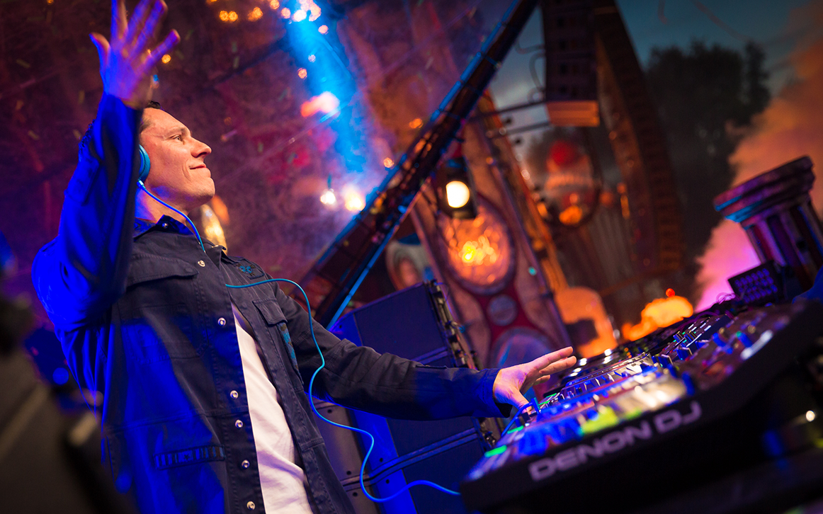
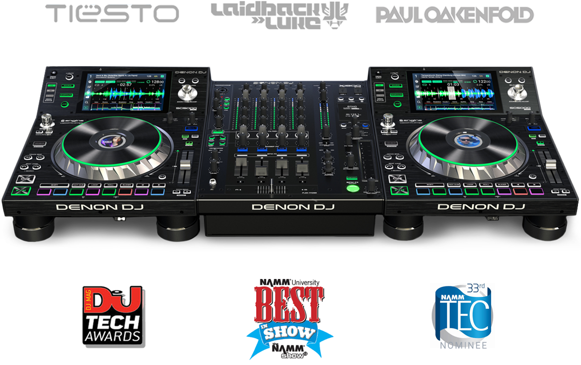
As Interaction Design Lead I successfully delivered a unique, playful, and low-learning-curve UI for a mature market product. As a result, Denon DJ was able to rapidly expand its passionate userbase, including many high-profile artists, and propel a multi-year business goal of market saturation.
...the biggest innovations are associated with workflow and usability....This is the singularly most impressive piece of DJ technology we've ever reviewed."
— Phil Morse, Digital DJ Tips
In the smartphone era where companies like Apple set a very high bar for user experience, Denon DJ has risen to the challenge of creating something modern, intuitive and easy to use."
— Wesley Bryant-King, DJ Times
The design is first class, the execution is exemplary. Great UI."
— Mark Settle, DJWorx
Solutions
Powering-up Fortune 500 companies and leading global brands.
![]() New York, NY USA
New York, NY USA

