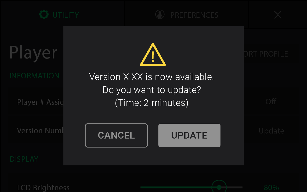
User interfaces often require button prompts for user-directed action, in order to collaborate clearly and effectively with the user to complete a task. Each screen presented to the user should contain a single primary action as it pertains to task completion and may contain one or more secondary actions. Our goal here as UI designers is to propel our user toward efficient task completion while eliminating uncertainty with each and every design decision we make.
Visual Weight
Visual weight describes how we direct users toward primary actions within an application by making design decisions that draw user attention. Primary and secondary actions should be easily differentiated. Visual distinction is also necessary for positive (i.e. Accept, Confirm, Apply) and negative (Delete, Remove) actions—safe, positive actions should receive the most visual weight. The clearer the visual weight is between buttons, the more efficiently users can complete their tasks.
Visual weight can be comprised of a variety of design choices not limited to: color, saturation, size, shape, placement, proximity, fill treatments and ability to visually contrast against a background environment. Neutral colors are best reserved for secondary actions, while eye-catching, saturated buttons are suitable for the efficient execution of primary actions.
Ghost Buttons = Ghost Conversions
When a button has an outline shape and no fill, this visual treatment is called a “ghost button.” Due to its more subdued quality, ghost buttons are most effective as secondary actions—you’ll often see this guideline violated with its use in call-to-action buttons online. Buttons with minimalist treatments are not strong solutions for creating a strong visual prompt and result in lower click-through and lower time-to-click rates when measured in A/B tests, click tests, and visual attention studies. In one study, the solid fill button outperformed a ghost button significantly: ~7%. If you decide to use a ghost button in your designs, it’s a wise idea to run an A/B test to help ensure your button properly converts.

Irreversible Actions
Primary action buttons help the user complete her immediate task. In the case of irreversible actions, a ‘Cancel’ button will often become the primary action—receiving the most visual weight. Applying primary action button treatment to Cancel results in the user taking a pause to carefully think through the available actions prior to selection. For example, a button allowing users to permanently delete data creates an environment where the user could regret her selection because the deletion process is often an irreversible action.
Button Placement Impacts Visual Flow
A primary button completing a user task belongs on the right—when placed in-line with additional button actions—as this placement results in fewer visual fixations and flows smoothly in a single direction. In this configuration, a user will quickly scan each button only once before landing squarely on the primary action. In terms of the mental load on a user, placing primary actions on the right result in more performant visual flows. If a designer were to reverse this button arrangement, it results in an unnatural eye-movement that turns against the viewing rhythm. Primary action buttons should be labeled with a function that moves the user forward in a task; this results in mapping to the ‘Back’ (regress) and ‘Next’ (progress) function configuration a user would expect.

Crystal Clear Labels
While a positive confirmation button labeled ‘OK’ may still be a popular labeling convention, more user-friendly applications are adopting buttons labeled with a specific action. Action specific button labels enable users to complete their tasks with more speed and accuracy. When lengthy dialog messages are ignored by users, well-labeled button actions help users complete their task successfully, while reducing errors. Clearly labeled action buttons that aren’t too verbose, will allow users to make their selection accurately every time.
Conventions are Stronger than the Eye
It may sound a bit strange to hear, but users are not always guided by their eyes. I believe this notion taps into one of my fine art professor’s lectures on the difference between looking and seeing, which I’ll dip into in a forthcoming blog post. At times, habits of convention take over for our users, thus creating error-prone “auto-pilot” situations when heavily utilized conventions are violated in a design. Consistency sets user expectation and reinforces speedy, predictable workflows within your application. Users wish to be rewarded for their strong visual literacy, and any design deviations from a heavy-trodden convention may cause more user pain than delight. It’s beneficial for UI designers to take a step back from their projects and seek to understand why a certain design convention may be widely used and where the improvement opportunities may live.
